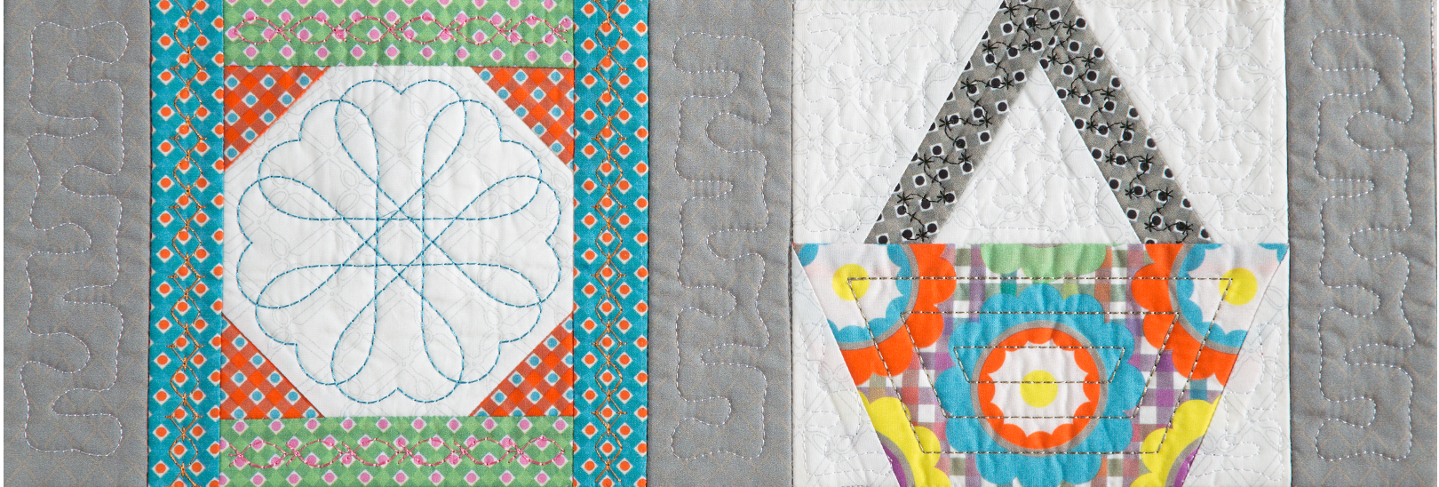
 I finally found some time to stitch a sample of the applique flower that we’ve been discussing over the past few Software Saturday posts. I selected a pink hand-dyed fabric for the flower and a subtle green batik print for the leaves. The center really needed a snappy yellow but I found my stash is totally lacking in yellows. So I cut a yellow section from a wild print fabric. It’s okay for the sample but I think I’ll look for a yellow with a bit more…zing!
The flower center looked so boring in the software I made one more digitizing change to the design before I actually stitched the sample. Here’s how to do it in Inspiration’s Perfect Embroidery Pro digitizing software:
Select the flower center, right click and select Break Up Path from the drop down menu. 
The design will be split into Run (your placement guide), Run (your tackdown) and Applique.  Select the Applique, right click and Convert to Steil.
Select the Steil and in the Property Box, change the Jagged Type to Both. 
Change the Value to 4.0 and click Apply. 
Now the flower center has much character than its original settings.
My next task is to select the final fabrics for this quilt and I could use some help. What color backgrounds do you like? White, black, blue, cream or gray? I’d love to hear your thoughts!


11 COMMENTS
Robin
9 years agoI think the change in the center made a huge difference. It gives the flower life!
maga
9 years agoI find white and black as background very stark but it is all the rage these days. Grey, cream and navy blue is more my colours and the Serenity colour from Pantone’s 2016 choice makes a very good neutral background for me.
Marti Morgan
9 years agoI like them all as backgrounds – although I rarely would choose black myself. I just keep putting the fabrics on top of the background until I feel happy (ha ha)
JD
9 years agoI love the new center on the flower. If the flowers are on individual blocks what about mixing it up with white, blue, cream and gray back grounds? I doubt I would use the black at it would be too stark a contrast. I guess you are using different colors for the flowers so mix up your “garden”.
Karen W
9 years agoNormally, B & W is rather stark, but totally “in” right now. At a recent quilt show, I saw an appliqued flowers garden-themed quilt design done by 5 different people – each a different colorway. They were all nice, but the B & W was to die for! Two-color quilts are always striking & depending on the fabrics, can be modern or traditional. Personally, I love soft aqua blues, but grey is such a lovely neutral these days – modern, but softer & hues to suit every taste!
Karen S
9 years agoI like the blue or gray or a blue/gray for the back ground.I like the change to the flower center.
Bruce
8 years agoI also like the color combination of blue and grey.
Bruce, https://www.printavo.com
Francine Meyer-Drasutis
9 years agoLove the change. It’s hard to say. Give us some samples to audition. I think it would be cool to maybe try badkins with gradual color changes.
Sandi Cunningham
9 years agoBLUE background, very light blue, like the sky would be fabulous! Save gray for a rainy day design.
Brenda Sadler
9 years agoBlue or Cream background. (I’m thinking sunny day for in the garden.) I really like the simple change to the center design.
Kati
9 years agoIt turned out beautiful!!!
Any hints how to do that in Wilcom editing? I’m still trying to learn the program…